Product recommendations are one of the most efficient ways to boost your sales, and SF Product Recommendations offers a comprehensive solution for enhancing product recommendations on a Shopify store. This article explains how you can customize the look and feel of the recommendation widget on the front end to catch the customer’s eye.
The application lets you customize each recommendation in your store based on your taste.
Customize widget appearance
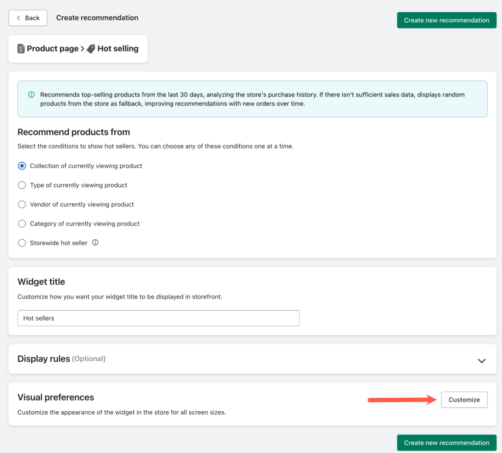
Selected a recommendation to configure and under Visual preferences, click on Customize to access the customization options.
The Visual preference window will provide a wide range of customization options, along with a live preview of how the widget will appear on the store.
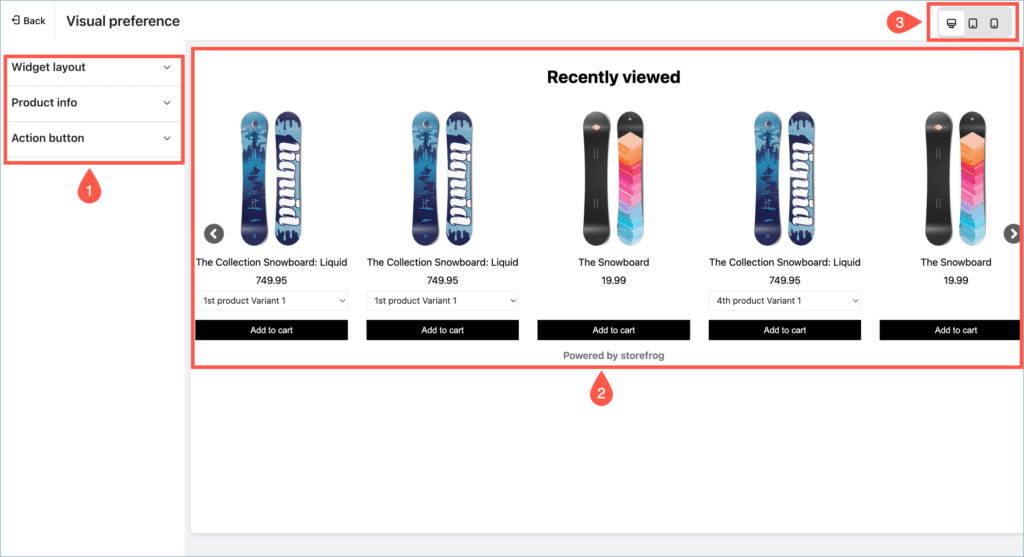
- Customization options – The sidebar contains a wide range of customization options that can be used to customize the appearance of the widget.
- Preview – The preview provides a clear idea of how the recommendation widget will appear on the store based on the customization options applied, in live time.
- Preview mode – Preview option for different devices. The preview will change based on the device type selected. The available preview options are:
- Desktop
- Tablet
- Mobile
Customization options
The customization options are divided into three sections.
- Widget layout – Customize the layout, title, number of products to display, display style, and more.
- Product info – Customize product info content, including price, title alignment, font color, and more.
- Action button – Customize the Add to cart button’s display, text, action, background color, and font color.
Widget layout
Widget layout section provides options to customize the layout of the recommendation widget as shown below :
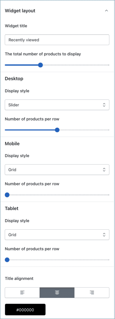
- Widget title – Text displayed as the title of the recommendation widget.
- Total number of products to display – The selected number of products will be displayed on the widget in total.
- Display style – The recommendation section will be displayed on the selected style. This option is individually customizable for Desktop, Mobile, and Tablet views. The available options are:
- Grid
- Slider
- List

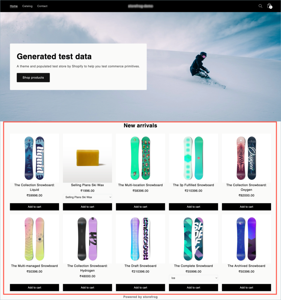
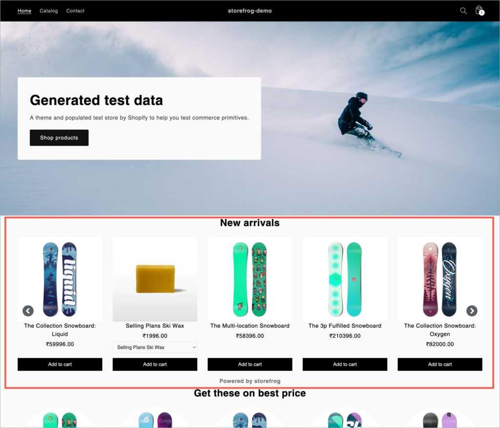
- Total number of products per row – The selected number of products will be displayed in a single row of the widget. This count is independently adjustable for Desktop, Mobile, and Tablet views.
The Total number of products per row function is not applicable for List layouts.
- Title alignment – The selected text alignment will be applied to the widget title. The available options are:
- Align to the left
- Align center
- Align to the right
- Font color – Font color of the title.
Product info
Product info section provides options to customize the product info content in the recommendation widget as shown below:
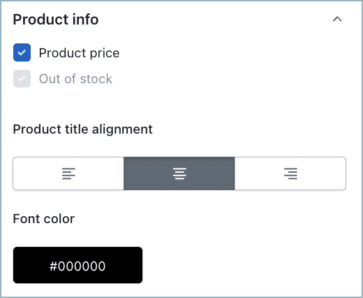
- Display – The selected data will be displayed on the widget.
- Product price – Select to display product price on the widget.
- Out of Stock – Select to display out-of-stock status for eligible items on the widget.
- Product title alignment – The selected text alignment will be applied to the product name. The available options are:
- Align to the left
- Align center
- Align to the right
- Font color – Font color of the product title.
Action button
Action button section provides options to customize the product info content in the recommendation widget as shown below:
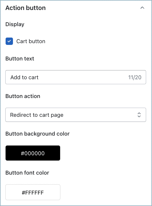
- Display – Unselect to hide the Add to cart button.
- Button text – Text displayed on the Add to cart button.
- Button action – The selected action will be triggered on selecting the Add to cart button. The available options are:
- Redirect to the cart page
- Stay on the page
- Redirect to the checkout page
- Button background color – Color of the Add to cart button.
- Button font color – Color of the text inside the Add to cart button.
After adjusting the appearance to your preferences, simply click on the Back button located in the top left corner to return to the main recommendation configuration page. Your changes will be automatically applied.