GDPR Cookie Consent plugin is equipped with several pre-defined templates for customizing the cookie notice bar to match the look and feel of your website. These customization features are incorporated in the Cookie law Settings > Themes tab of the plugin. Besides, there are provisions to select predefined templates for cookie bars with each type banner, widget, or popup.
Refer Customize Cookie Notice bar with pre-defined templates to know more about it.
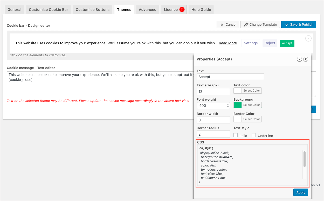
In addition to having options to modify the pre-defined templates, the cookie notification bar can be customized by inserting/editing CSS style codes in the CSS field of the properties dialog box.
Themes-CSS
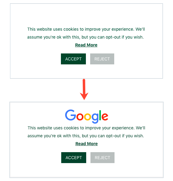
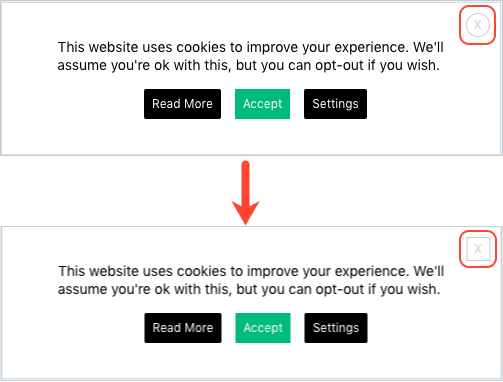
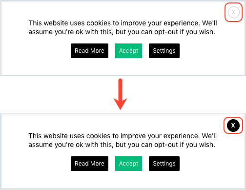
Following are a few examples of how you can customize the CSS code snippet from the Design editor to enhance the look and feel of the cookie notification bar.
- Inserting Logo on top of the Cookie Notification bar: Popup (theme 1)
.cli_style {
    background: #fff url('https://www.google.com/images/branding/googlelogo/1x/googlelogo_color_150x54dp.png') no-repeat center 20px;
    border:solid 0px #dbdbdb;
    color:#08402c;
    padding:45px;
    padding-top:70px;
    box-sizing: border-box;
    width:500px;
    text-align:center;
    display:inline-block;
    font-size:14px;
    line-height:26px;
    letter-spacing:normal;
}
- Square close button: Popup (theme 3)
.cli_style {
    display: inline-block;
    background:none;
    border-radius:0px;
    border:solid 1px #ccc;
    color: #ccc;
    text-align: center;
    font-size: 12px;
    width:22px;
    height: 22px;
    line-height: 22px;
    margin-right:-25px;
    margin-top:-25px;
    float: right;
    right:0px;
    cursor:pointer;
}

- Color filled closed button: Popup (theme 3)
.cli_style {
    display: inline-block;
    background: rgb(0, 0, 0) repeat scroll 0% 0%;
    border-radius: 20px;
    border: 0px solid rgb(204, 204, 204);
    color: rgb(255, 255, 255);
    text-align:center;
    font-size: 12px;
    width: 26px;
    height: 26px;
    line-height: 26px;
    margin-right: -25px;
    margin-top: -25px;
    float: right;
    right: 0px;
    cursor: pointer;
    font-weight:bold;
}

- Button shadow: Popup (theme 1)
.cli_style {
    display: inline-block;
    background:#babfbe;
    border-radius:0px;
    color:#fff;
    text-align: center;
    font-size:14px;
    padding:5px 14px;
    margin-left:10px;
    margin-top:15px;
    border:solid 0px #fff;
    text-transform:uppercase;
    line-height:26px;
    box-shadow:2px 2px 5px #333;
}

- Image background on the button: Widget (theme 3)
.cli_style {
    display:inline-block;
    box-sizing:border-box;
    width:48%;
    padding:8px 10px;
    color:#010101;
    background:url('https://i.ibb.co/g6ndsF1/tick.png') no-repeat 20px 10px #f3da00;
    text-align:center;
    border-radius:6px;
    font-size:18px;
    border:solid 0px #fff;
    line-height:28px;
    font-size:18px;
    margin-top:20px;
    font-weight:600;
}
